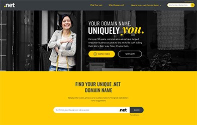
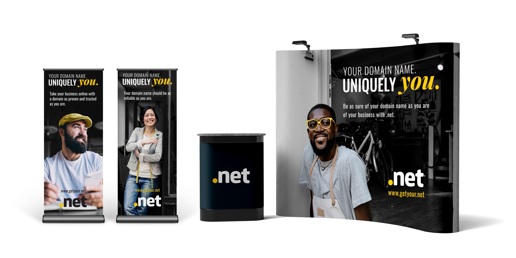
“Your Domain Name. Uniquely You.”
The marketing team came up with the campaign slogan "Your Domain Name. Uniquely You." and asked us to explore what that could look like visually. I created and pitched the final creative direction, then led the design work across digital and motion assets.
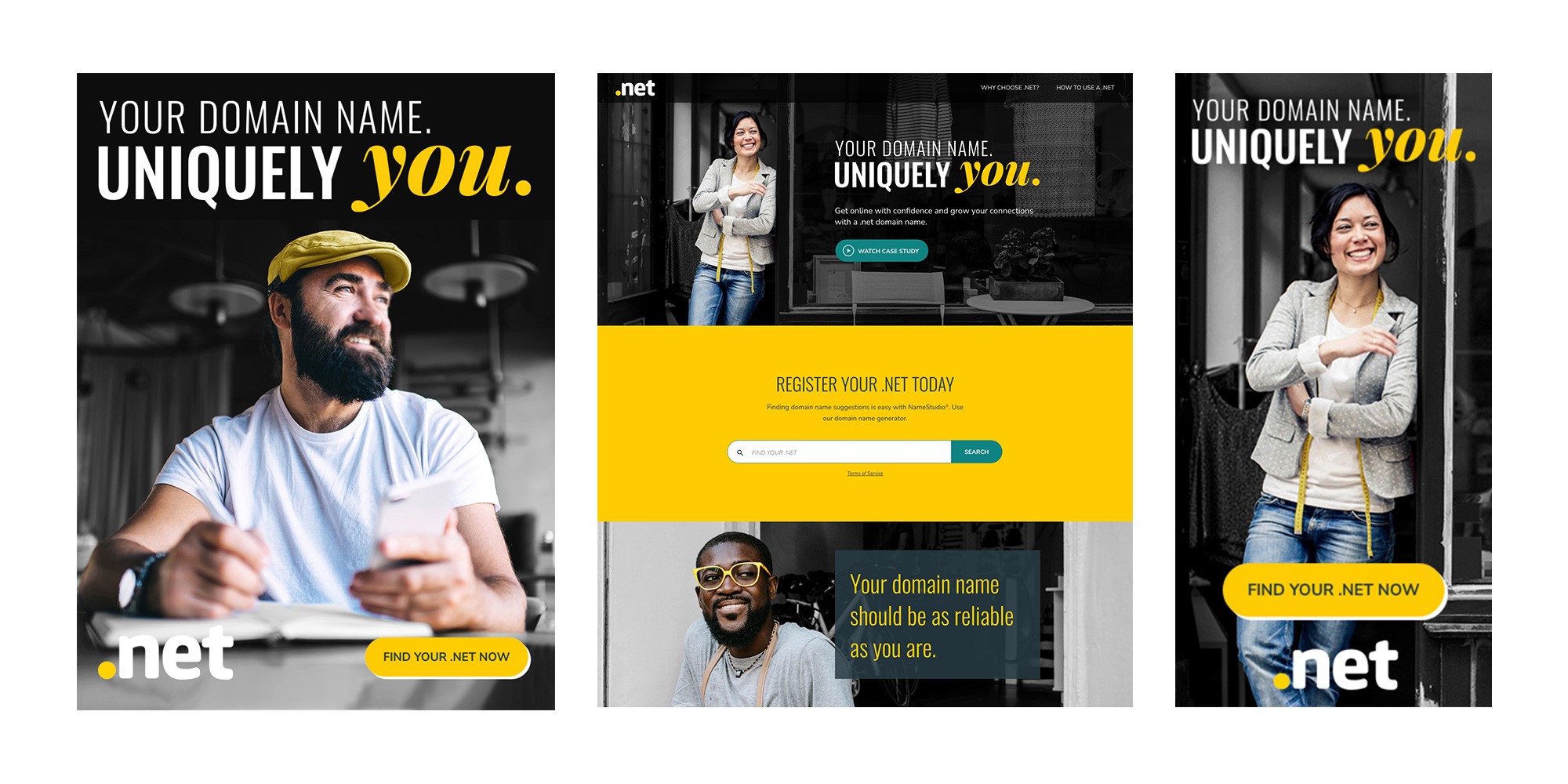
net had a solid reputation—trusted, dependable, reliable. But it didn't feel personal. Our challenge was to evolve the brand from "safe and steady" to something more empowering and inspiring. We wanted to create a visual identity that put small business owners at the center: authentic, confident, and uniquely themselves—while keeping it simple enough to scale across every platform.
Our Goals
Make .net feel personal and empowering while staying simple and scalable.
Elevate the visibility of the .net brand
Drive awareness, build brand preference, and increase engagement

The Stock Photo Problem
Stock photos often feel inauthentic—too polished, too staged. My approach was different: I curated images showing business owners in candid moments, then built a visual system around them.
My Solution:
I developed a three-part visual system:
|  |
Authentic imagery – I curated stock photos showing business owners in their element: collaborating with teams, serving customers, building something real
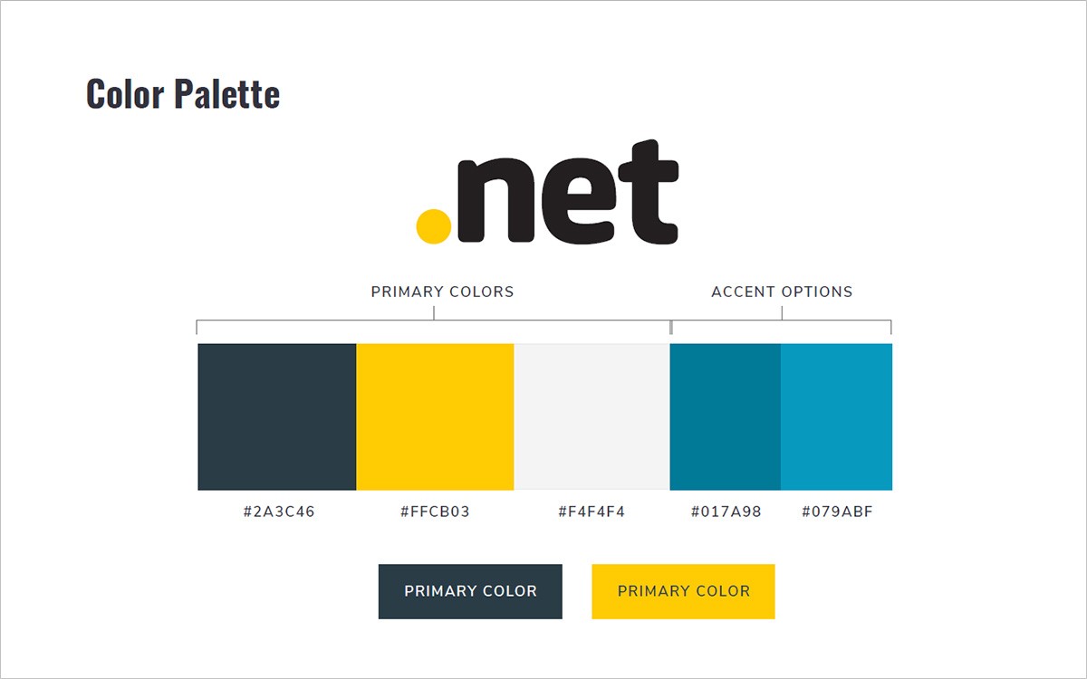
Strategic color use – .net's yellow became the hero, applied as a focal accent throughout every asset
Black and white treatment – Converting the rest to monochrome kept the focus on people, not backgrounds
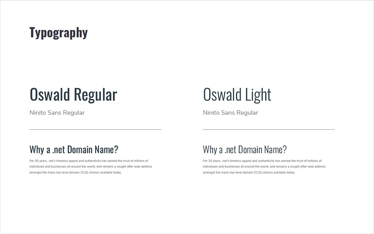
The Design Foundations
Campaign Assets
I brought this system to life across the full campaign:
Web experiences and product pages
Display advertising and social content
Motion graphics and video assets
Email and promotional materials
Campaign Metrics
Independent testing showed stronger performance compared to prior campaigns in similar markets and demographics.
Increase in engagment:
11.7%
Increase in brand favoribility:
18.7%
What began as a challenge to make stock photography feel memorable became a bold, ownable identity for .net. The black-and-white imagery with a single yellow accent gave the brand new energy — one that resonated with small business owners and drove measurable gains in awareness and engagement.
