Verisign Website
Verisign’s new corporate website redefines how the company presents its brand, mission, and services to a global audience. I helped shape the visual and user experience foundation—from early moodboards and color systems to UX structure and navigation—guiding the redesign from concept through launch.
2026
CLIENT
Verisign, Inc.
Role
Senior UX Designer
Skills
Brand Identity, UX Design
Tools

"Verisign enables the world to connect online with reliability and confidence, anytime, anywhere."
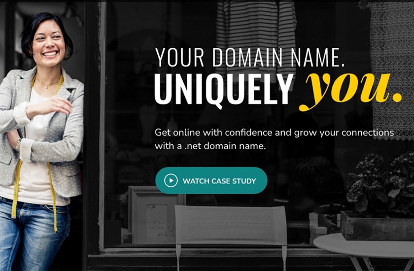
Verisign's legacy site had grown complex over the years—layered with content, fragmented visual language, and inconsistent UX patterns. The goal was to create a clean, modern, unified platform that communicated Verisign's role in securing the internet while improving the user journey for audiences ranging from investors and partners to registrars and media.
Our Goals
Reinforce Verisign's position as a trusted internet leader through a design language that conveys security, stability, and innovation
Establish a flexible design foundation that could scale to support future pages, campaigns, and global audiences
Enhance accessibility and performance, ensuring WCAG compliance and a seamless experience across devices
Research & Alignment
We started with deep research and alignment sessions across corporate teams to map user needs and define priorities.

Design Foundation
I worked with the Creative Director to establish the color palette, typography, and accessibility framework that unified the brand across platforms. We presented design directions to senior leadership to gain alignment and buy-in.
Collaboration & Iteration
Partnering with content strategists, developers, and product owners, we refined layouts and interactive elements through multiple review cycles.

Tools
Color & Typography System
I defined a new color palette and typographic framework that unified Verisign's digital and print materials, creating visual consistency across every touchpoint.


Scalable Design Framework
I created a flexible design system to support future pages, campaigns, and global site expansion while maintaining visual and structural coherence.
Accessibility Alignment
I ensured WCAG-compliant color contrast, typography, and interaction patterns, establishing a foundation for inclusive design across Verisign's web properties.
The Impact
The redesigned Verisign.com launched as a cohesive, future-ready platform that embodies the company's mission of security, stability, and reliability online.
The site balances Verisign's technical authority with clear, approachable design. The design system I created established a foundation for continued growth, supporting new pages, campaigns, and microsites with a cohesive visual and UX framework that continues to guide Verisign's digital presence today.