Verisign’s new corporate website redefines how the company presents its brand, mission, and services to a global audience. I helped shape the visual and user experience foundation—from early moodboards and color systems to UX structure and navigation—guiding the redesign from concept through launch.
"Verisign enables the world to connect online with reliability and confidence, anytime, anywhere."

Verisign.com legacy home page

Verisign.com new home page
The Challenge
Verisign's legacy site had grown complex over the years—layered with content, fragmented visual language, and inconsistent UX patterns. The goal was to create a clean, modern, unified platform that communicated Verisign's role in securing the internet while improving the user journey for audiences ranging from investors and partners to registrars and media.
Our Goals
Reinforce Verisign's position as a trusted internet leader through a design language that conveys security, stability, and innovation
Establish a flexible design foundation that could scale to support future pages, campaigns, and global audiences
Enhance accessibility and performance, ensuring WCAG compliance and a seamless experience across devices
The Approach
Research & Alignment
We started with deep research and alignment sessions across corporate teams to map user needs and define priorities.
Design Foundation
I worked with the Creative Director to establish the color palette, typography, and accessibility framework that unified the brand across platforms. We presented design directions to senior leadership to gain alignment and buy-in.
Collaboration & Iteration
Partnering with content strategists, developers, and product owners, we refined layouts and interactive elements through multiple review cycles.

Early navigation flow aligning UX research with content priorities.

Moodboard exploration setting tone for a more modern and human brand voice.

Color palette refinement focused on clarity, accessibility, and contrast.

Typography system designed for scalability and accessibility, ensuring consistency across product, marketing, and corporate communications.
Key Contributions
Color & Typography System
I defined a new color palette and typographic framework that unified Verisign's digital and print materials, creating visual consistency across every touchpoint.
UX Architecture & Navigation
I partnered with UX researchers to conduct testing and streamline site architecture and navigation, improving clarity and accessibility for diverse audiences.
Scalable Design Framework
I created a flexible design system to support future pages, campaigns, and global site expansion while maintaining visual and structural coherence.
Accessibility Alignment
I ensured WCAG-compliant color contrast, typography, and interaction patterns, establishing a foundation for inclusive design across Verisign's web properties.
The Result
The final site feels both authoritative and approachable—balancing Verisign's technical depth with clear, confident design. The new system established a foundation for future growth, supporting additional pages, campaigns, and microsites with a cohesive visual and UX framework that continues to guide Verisign's digital presence today.
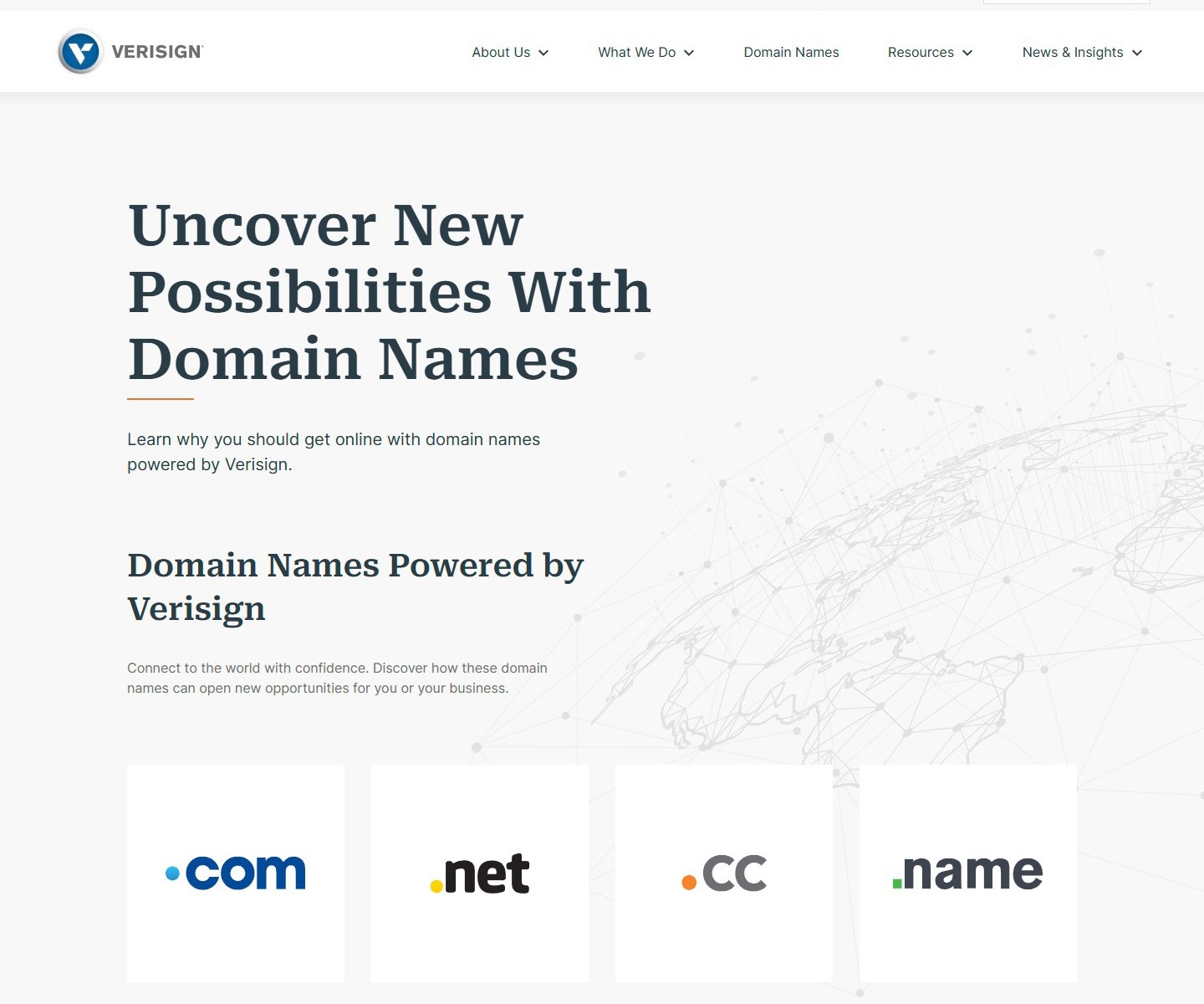
Verisign.com domain names page
More Work

.net Campaign
Designed creative concept for global marketing campaign
.com Campaign
Designed motion graphics for global domain name campaign


NameStudio
Co-designed patented domain search tool serving millions of users
